Writing a Custom Scroll View with SwiftUI in a chat application

When you are writing a chat application, you need to be able to have some control on the chat view. The chat view typically starts aligned at the end of the conversation, which is the bottom of the screen. When you have received more messages and they cannot fit on one screen anymore, you can scroll back to display them.
However, using only SwiftUI standard ScrollView to build such a conversation view is not possible in the first release of SwiftUI (as of Xcode 11), as no API is provided to define the content offset and start with the content at the bottom. It means that you would be stuck to displaying your chat window and the top and scroll down to see the new messages, which is not acceptable.
We can help you build your next iOS app in weeks rather than months
Read more about ProcessOne and Swift »
In this article, I will show you how to write a custom scroll view to get the intended behaviour. It will not yet be a fully-featured scroll view, with all the bells and whistles you expect (like, for example, a scroll bar), but it will be a good example showing what is required to build SwiftUI custom views. You can then build on that example to add the features you need.
Note: The code was tested on Xcode 11.0.
What is a scroll view?
A scroll view is a view that lets you see more content that can fit on the screen by dragging the content on the screen to display more.
From a technical point of view, a scroll view contains another view that is larger than the screen. It will then handle the “drag” events to synchronize the displayed part of the content view.
Custom SwiftUI scroll view principles
To create a custom SwiftUI view, you generally need to master two SwiftUI concepts:
- GeometryReader: GeometryReader is a view wrapper that let child views access sizing info of their parent view.
- Preferences: Preferences are used for the reverse operation. They can be used to propagate information from the child views the parent. They are usually attached to the parent by creating a view modifier.
Creating an example project
We will be creating an example project, with an example conversation file in JSON format to illustrate the view rendering.
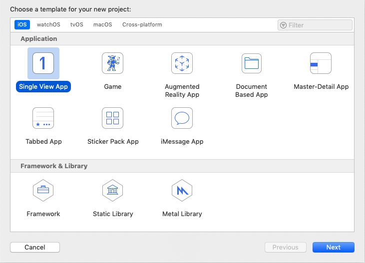
Create a new project for iOS, and select the Single View App template:
Choose a name for the new project (i.e. SwiftUI-ScrollView-Demo) and make sure you select SwiftUI for User Interface:
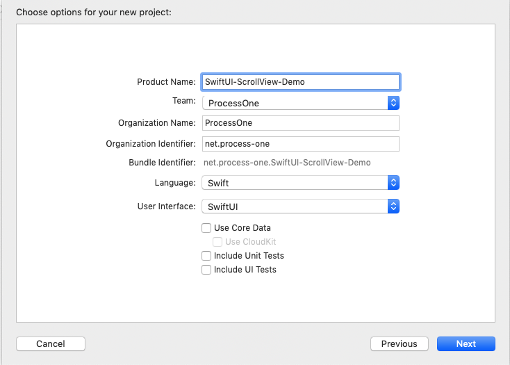
You are ready to start your example project.
Creating a basic view with the conversation loaded
Create a Models group in SwiftUI-ScrollView-Demo group and create a Swift file name Conversation.swift in that group.
It will contain a minimal model to allow rendering a conversation and populate a demo conversation with test messages, to test our ability to put those messages in a scroll view.
//
//  Conversation.swift
//  SwiftUI-ScrollView-Demo
//
struct Conversation: Hashable, Codable {
    var messages: [Message] = []
}

struct Message: Hashable, Codable, Identifiable {
    public var id: Int
    let body: String
    // TODO: add more fields (from, to, timestamp, read indicators, etc).
}

// Create demo conversation to test our custom scroll view.
let demoConversation: Conversation = {
    var conversation = Conversation()
    for index in 0..<40 {
        var message = Message(id: index, body: "message \(index)")
        conversation.messages.append(message)
    }
    return conversation
}()
Preparing the BubbleView
In this article, the message BubbleView will not look like a chat bubble. It will just be a raw cell with a gray background.
Create a new SwiftUI file named BubbleView,swift in the SwiftUI-ScrollView-Demo group.
The content of the file is as follows:
//
//  BubbleView.swift
//  SwiftUI-ScrollView-Demo
//
import SwiftUI

struct BubbleView: View {
    var message: String

    var body: some View {
        HStack {
            Spacer()
            Text(message)
        }
        .padding(10)
        .background(Color.gray)
    }
}

struct BubbleView_Previews: PreviewProvider {
    static var previews: some View {
        BubbleView(message: "Hello")
            .previewLayout(.sizeThatFits)
    }
}
It renders a right-aligned text message, with padding and gray background.
With the custom preview layout, the canvas preview will only show you the content of that view, with the preview message “Hello”:

Working on the main conversation view
You can now edit the ContentView.swift file to render your custom scroll view.
First rename your ContentView to ConversationView using the new Xcode refactoring.
Then, you can prepare your list of messages in the conversation and render then in a VStack. We put that VStack in a standard scroll view, to be able to see all the messages by scrolling the Vstack inside the scroll view.
//
//  ConversationView.swift
//  SwiftUI-ScrollView-Demo
//
import SwiftUI

struct ConversationView: View {
    var conversation: Conversation

    var body: some View {
        NavigationView {
            ScrollView {
                VStack(spacing: 8) {
                    ForEach(self.conversation.messages) { message in
                        return BubbleView(message: message.body)
                    }
                }
            }
            .navigationBarTitle(Text("Conversation"))
        }
    }
}

struct ContentView_Previews: PreviewProvider {
    static var previews: some View {
        ConversationView(conversation: demoConversation)
    }
}
The preview is getting our demoConversation to render our example conversation.
Note that you also need to edit your SceneDelegate to pass the demoConversation as a parameter when setting up your ConversationView:
//  SceneDelegate.swift
// ...
        // Create the SwiftUI view that provides the window contents.
        let contentView = ConversationView(conversation: demoConversation)
// ...
We now render all the message in our demo Conversation, but we see that the conversation is top aligned and there is no API at the moment to control the content offset to render the display from the bottom of the scroll view on init.
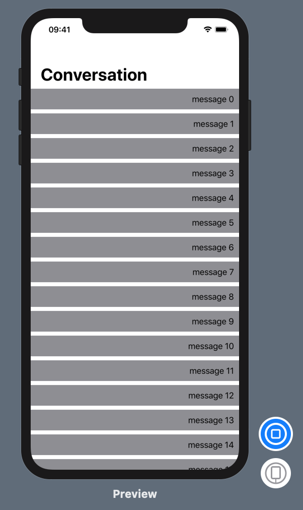
We will fix that in a moment by writing a custom scroll view.
Bootstraping our custom scroll view
Add a new SwiftUI file called ReverseScrollView.swift in the project.
You can then first create your ReverseScroll View to first adapt the VStack to the parent view geometry, thanks to GeometryReader. By wrapping the content of the ReverseScrollView inside a GeometryReader wrapper, you can access info about the “outer” geometry (like the height).
Here is an initial version of the ReverseScrollView:
//
//  ReverseScrollView.swift
//  SwiftUI-ScrollView-Demo
//
//  Created by Mickaël Rémond on 24/09/2019.
//  Copyright © 2019 ProcessOne. All rights reserved.
//
import SwiftUI

struct ReverseScrollView<Content>: View where Content: View {
    var content: () -> Content

    var body: some View {
        GeometryReader { outerGeometry in
            // Render the content
            //  ... and set its sizing inside the parent
            self.content()
            .frame(height: outerGeometry.size.height)
            .clipped()
        }
    }
}

struct ReverseScrollView_Previews: PreviewProvider {
    static var previews: some View {
        ReverseScrollView {
            BubbleView(message: "Hello")
        }
        .previewLayout(.sizeThatFits)
    }
}
You can also replace the ScrollView in ConversationView to use our ReverseScrollView:
//...
        NavigationView {
            ReverseScrollView {
                VStack {
//...
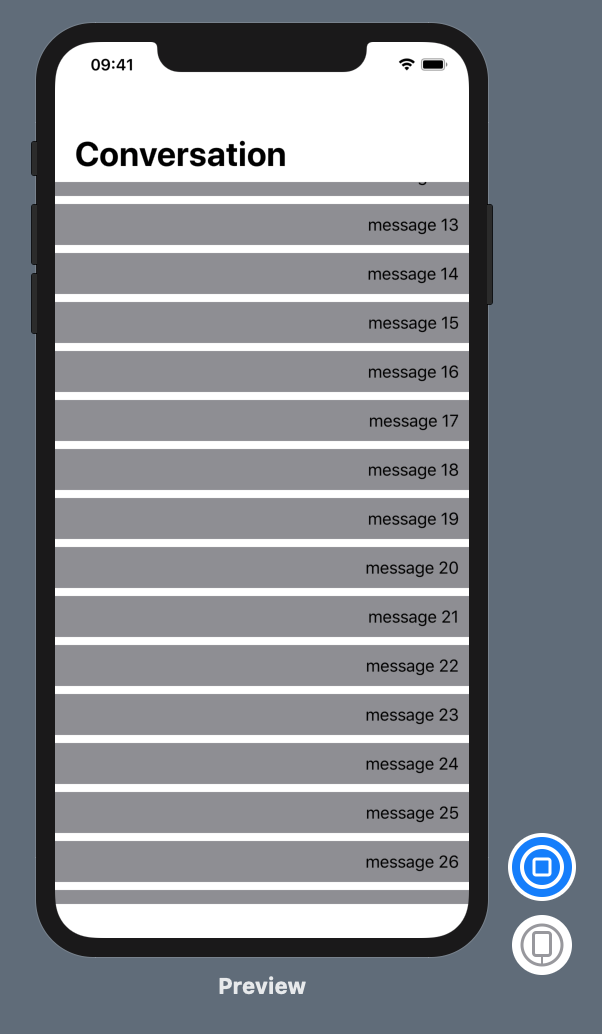
In the Canvas, you can see the view is not scrolling or displayed properly with the last message at the bottom, but it is now properly fitting inside its parent view.
Aligning our view content to the bottom of the ReverseScrollView
The next step is to use preferences to pass the size of the content view to our ReverseScrollView. This will allow us to align the content of the view to the bottom of our custom ScrollView.
To do that we will leverage a SwiftUI feature called preferences. The preferences will be used to track the content size in the ReverseScrollView to properly set the content offset so that it is bottom aligned.
To track the content view height, we need to define a PreferenceKey that will keep track of the total height of the view. It will sum up the value of the height of all subviews in its reduce static function. To do so, add the following code to your ReverseScrollView file:
struct ViewHeightKey: PreferenceKey {
    static var defaultValue: CGFloat { 0 }
    static func reduce(value: inout Value, nextValue: () -> Value) {
        value = value + nextValue()
    }
}
You then need to make that ValueHeightKey a view modifier that will use a few tricks to read the content size and propagate the value:
- The view modifier is embedding a geometry reader in our content background to read the geometry. It will work, as the size of the background content is the same as the content itself.
- The view modifier will then set the Color.clear preference for that key to propagate them to the parent, listening to them using onPreferenceChange event. We are setting Color.clear preference, as we need to generate a view here and we actually want to hide that background. This trick makes it possible to read and propagate the preference, using a “dummy” background view.
Here is the view modifier extension for our ViewHeightKey:
extension ViewHeightKey: ViewModifier {
    func body(content: Content) -> some View {
        return content.background(GeometryReader { proxy in
            Color.clear.preference(key: Self.self, value: proxy.size.height)
        })
    }
}
Finally, we need to keep track of that Content View Height in a ReverseScrollView state. To do so:
- We add a ContentHeight state to our ReverseScrollView.
- We apply our view modifier ViewHeightKey to the content view.
- We set our contentHeight State in the onPreferenceChange event for the ViewHeightKey values.
- We update the content offset to the y axis on the content. To calculate the offset, we use the following offset function. It is using scrollview height and content height to calculate the offset so that the content is bottom-aligned (see below).
    // Calculate content offset
    func offset(outerheight: CGFloat, innerheight: CGFloat) -> CGFloat {
        print("outerheight: \(outerheight) innerheight: \(innerheight)")

        let totalOffset = currentOffset + scrollOffset
        return -((innerheight/2 - outerheight/2) - totalOffset)
    }
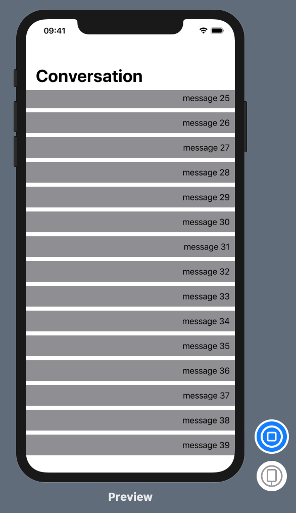
The content view is now bottom-aligned and the last message (Message 39) is properly displayed at the bottom of our custom scroll view.
You can check the final code in ReverseScrollView.swift.
Making our scroll view scrollable
The final step is to make our custom scroll view able to scroll, synchronized with vertical drag events.
First, we need to add two new states to keep track of the scroll position:
- The current scroll offset set the content offset after the drag event ended.
- The scroll offset is used to synchronize the content offset while the user is still dragging the view.
We will update those two states during on drag events onChanged and onEnded.
Here is the operation on ongoing drag event:
    func onDragChanged(_ value: DragGesture.Value) {
        // Update rendered offset
        print("Start: \(value.startLocation.y)")
        print("Start: \(value.location.y)")
        self.scrollOffset = (value.location.y - value.startLocation.y)
        print("Scrolloffset: \(self.scrollOffset)")
    }
and when drag ends, we store the current position, enforcing top and bottom limits:
    func onDragEnded(_ value: DragGesture.Value, outerHeight: CGFloat) {
        // Update view to target position based on drag position
        let scrollOffset = value.location.y - value.startLocation.y
        print("Ended currentOffset=\(self.currentOffset) scrollOffset=\(scrollOffset)")

        let topLimit = self.contentHeight - outerHeight
        print("toplimit: \(topLimit)")

        // Negative topLimit => Content is smaller than screen size. We reset the scroll position on drag end:
        if topLimit < 0 {
             self.currentOffset = 0
        } else {
            // We cannot pass bottom limit (negative scroll)
            if self.currentOffset + scrollOffset < 0 {
                self.currentOffset = 0
            } else if self.currentOffset + scrollOffset > topLimit {
                self.currentOffset = topLimit
            } else {
                self.currentOffset += scrollOffset
            }
        }
        print("new currentOffset=\(self.currentOffset)")
        self.scrollOffset = 0
    }
We also need to update the offset calculation to take into account the drag states:
    // Calculate content offset
    func offset(outerheight: CGFloat, innerheight: CGFloat) -> CGFloat {
        print("outerheight: \(outerheight) innerheight: \(innerheight)")

        let totalOffset = currentOffset + scrollOffset
        return -((innerheight/2 - outerheight/2) - totalOffset)
    }
Finally, you need to track the gesture on the content view, and link those gestures to our drag function:
            self.content()
            // ...
            .animation(.easeInOut)
            .gesture(
                 DragGesture()
                    .onChanged({ self.onDragChanged($0) })
                    .onEnded({ self.onDragEnded($0, outerHeight: outerGeometry.size.height)}))
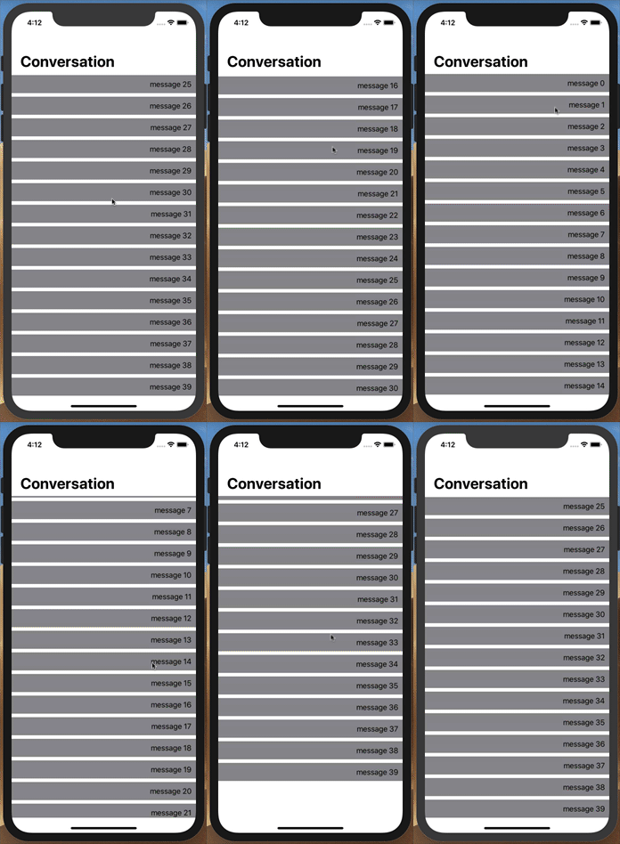
We used the opportunity to also apply some animation to smoothen the end drag scroll position correction when hitting the limit. We now have a custom scroll view that starts at the bottom and can be properly scrolled with proper top and bottom limits.
Final project
You can download the final project example from Github: SwiftUI-ScrollView-Demo.
What’s next?
Let us know in the comments if you are interested in follow-up blog posts. Here are possible additional features that could make sense to illustrate in detail:
- Handle device rotation
- Show how to add messages to the conversation
- Kinetic scroll with deceleration
- Better bounce when hitting limits
- Add a scroll bar
- Kinetic animation for chat bubbles when scrolling (bit of springy behaviour)
Photo by Alvaro Reyes, Unsplash
